5 B2B eCommerce Storefront Settings That Makes a Difference
5 B2B eCommerce Storefront Settings That Makes a Difference
When you’re running a B2B eCommerce storefront, the difference between “nice website” and “this actually drives revenue” often comes down to a handful of settings that most brands barely think about.
B2B buyers are not browsing for fun. They’re busy, often repeat-ordering, and under pressure to get the right products in the right quantities as quickly as possible. Your storefront should support that – not slow it down.
In Turis, we’ve seen again and again that getting a few key storefront decisions right can noticeably increase order size, re-order frequency, and overall customer satisfaction. Below are five storefront settings (plus one bonus) that shape the B2B buying journey in a big way – and how you can configure them to match your products and buyers.
Pop-up vs. Dedicated Product Page: How Much Focus Do Your Products Need?
The first big decision:
What happens when a buyer clicks a product?
In Turis, you can choose between:
- Quick-view pop-up
- Dedicated product page
Both are valid. The “right” choice depends on your buyers and how they usually purchase.
Pop-up view works best when:
- Customers typically buy many different products in one session
- They don’t need long descriptions for each item
- Your sales are repeat-heavy, where buyers already know your assortment
In this case, a pop-up is perfect. Your buyers can:
- Check just enough details (price, basic info, variants)
- Add to cart directly from the pop-up
- Continue scrolling without any page loads or deep navigation
The result is a fast, almost spreadsheet-like buying experience – ideal for wholesalers and distributors where efficiency matters more than storytelling.
Dedicated product pages make more sense when:
- Products require more explanation
- Visuals and presentation play a big role in conversion
- Buyers need to compare details before committing
With Turis’ Dedicated Product Page setting, clicking a product takes the buyer to a full page with:
- Larger product images
- Structured descriptions and specifications
- Room for supporting content (usage, materials, technical details, etc.)
This reduces background noise and gives each product its own stage – valuable for brands where product story and detail matter more than sheer speed.
Key question to ask yourself:
Are my buyers trying to fly through orders, or do they need to understand each product before buying?
You can also mix the two, using:
- Pop-ups for familiar, “routine” products
- Dedicated pages for hero products or complex items
Variants: Group Smartly to Speed Up Ordering
Most brands start with internal product categories – the way the ERP or warehouse sees the world. Those categories are often:
- Too technical
- Too granular
- Misaligned with how buyers actually search and decide
For a B2B eCommerce storefront, that’s a problem.
eCommerce-suited categories should:
- Reflect the buyer journey, not your internal system
- Help new buyers understand your assortment at a glance
- Make it easier for existing customers to reorder quickly
In Turis, we often see a performance jump when brands:
- Reduce the number of top-level categories
- Group products into clearer, buyer-centric buckets
- Keep internal categories for ERP and inventory — but present a cleaner structure in the storefront
For example, instead of:
- “SKU Group A3”
- “Line 12 – Mix”
- “Internal Code: 456”
You might use:
- “New Collections”
- “Core Bestsellers”
- “Seasonal Specials”
- “Accessories”
Why fewer top-level categories often wins
When you have 20+ top-level categories, buyers are forced to guess where to start. That creates friction and can reduce order value.
Brands that consolidate into fewer, well-named categories usually see:
- Better navigation
- Faster product discovery
- Higher sales per session
You still respect your original structure behind the scenes, but you present something your buyers actually understand.
Home Page: Jump Straight to Buying or Guide First?
Your home page in a B2B storefront shouldn’t just be “pretty.” It should match how ready to buy your customers typically are when they log in.
With Turis, you can decide whether the home page is:
- A product overview (e.g., All Products)
- A content-rich page built in Page Builder
Send buyers straight to All Products if:
- They log in primarily to reorder
- They already know your assortment
- Speed is the main priority
In this setup, the All Products view becomes your “home base.” Filters, search, and categories do the heavy lifting, and buyers can get straight to adding items to their cart.
Use a content home page if:
- Your brand needs a bit of context before buying
- You launch new collections, campaigns, or promotions regularly
- You want to highlight assortments or guide buyers to certain areas of the catalog
Using Turis’ Page Builder, you can create:
- Campaign sections
- “Start here” guides
- Brand storytelling blocks
- Links to key categories or curated assortments
Then set that page as your home page, so buyers always see your most important content first.
There’s no universal rule here. Some brands use a content-based home page for new or less experienced customers and gradually move them toward a more product-driven entry point as they become regular buyers.
Checkout Layout: Compact vs. Wider, Linear Flow
The checkout flow is the final step in your B2B buying journey – and small layout choices can have a big impact on how confident and fast buyers feel.
Turis offers different checkout layouts so you can match:
- Order size
- Buyer type
- Level of detail you need to capture
Compact checkout works best when:
- Orders are frequent and familiar
- Buyers know exactly what they’re doing
- You want to reduce friction and clicks
Everything feels tight and efficient, so buyers can complete their order quickly without being distracted.
A wider, more linear checkout is better when:
- Orders are larger or more complex
- There are more fields or conditions to review
- Buyers need reassurance at each step (delivery, payment, terms, etc.)
The linear layout gives more space for each step, making it clear what happens next and what’s required. This can improve conversion for higher-value or more sensitive orders, where buyers might hesitate if details feel hidden or cramped.
Again, think about your buyer type:
Newer, more cautious buyers might feel safer in a clearer, step-by-step layout.
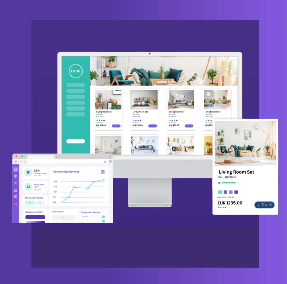
Bonus: Stock Information – The Silent Sales Driver
Stock information is one of those settings that many brands either skip or underthink. That’s a missed opportunity.
B2B buyers care a lot about availability. How you present stock information in your B2B eCommerce storefront directly influences:
- Whether they buy now or later
- Whether they add extra units “just in case”
- How much they trust you as a supplier
In Turis, you can configure:
- How stock levels are shown (numbers, indicators, etc.)
- Whether certain products can be ordered even below zero using Allow Back Orders
Why showing stock is powerful
- Low stock can create urgency: buyers may move faster or increase quantities.
- High stock sends a signal of reliability: “This item is core, always available.”
- No stock info at all leaves buyers guessing — which often results in hesitation or smaller orders.
If you have products that never really go out of circulation, enabling Allow Back Orders makes sense. It tells your customers:
“Even if stock dips temporarily, you can still place your order. We’ll fulfill it.”
That reassurance can keep orders flowing even during restocks or temporary stock dips.
Putting It All Together: Designing a B2B Storefront That Actually Sells
A strong B2B eCommerce storefront is not just a digital catalog. It’s a buying tool.
When you:
- Choose between pop-up and product page views based on buying behavior
- Present variants in a way that fits how buyers order
- Structure categories around the buyer journey rather than internal logic
- Set the right home page for your type of customer
- Match the checkout layout to order complexity
- And treat stock visibility as a strategic choice, not an afterthought
…you give your buyers a storefront that feels built for them.
Most brands don’t go this far. They upload products, turn on a standard layout, and hope their B2B buyers figure it out. The ones who actually tune these settings gain a real advantage: faster orders, larger baskets, more confident buyers, and fewer support questions.
Turis is built exactly for this kind of fine-tuning. You can configure each of these areas in a way that fits your products, your buyers, and your workflows – down to variant views, category structures, and stock behavior per product or category.
Get these fundamentals right, and your B2B eCommerce storefront stops being “just another portal” and starts becoming a real sales engine for your brand.